Month: May 2016

  • Full Moon Spread

    So I thought I’d come up with a Full Moon spread for the fans of the Wildwood Tarot over there in facebookland. Am popping it here in case it might be something that you want to add to your own toolbox.

    You can use any deck 🙂

    Focus on one aspect of your life that you seek clarity on and think about The Moon* card from your deck (it’s going to be acting as your totem in this spread).  Give your cards a good shuffle, face-side down. When you have shuffled sufficiently, turn your deck over, face-side up.

    Without changing the order of the cards in your deck, work your way through the upturned deck until you spot your Moon card.

    The card ON TOP (ie the card in front of, or before, The Moon) shows you the energies that can be embraced to gain clarity.

    The card BEHIND (ie after) The Moon will show you the energies that no longer serve you in this issue and can be let go to help bring clarity to the situation

    You don’t need to interpret The Moon card itself as it was acting as our sign post to find the best cards.

    * If your deck doesn’t have a Moon card, pick another card that has a prominent moon feature.  

  • The Sunday Times Rich List Tarot Cards | Sam Dunn

    So, the Sunday Times Rich List campaign featured some cleverly updated Tarot cards, depicting some famous faces.


    I got in touch with the artist behind the campaign, Sam Dunn,  and she agreed to answer some of my questions about the artwork 🙂


    Me:   How did you get involved in the campaign?


    Sam: Through my agents at Blink Art, they had been contacted by CHI about the project who thought my work would be a good fit.


    Me: Was the idea of Tarot cards presented to you, or did you come up with that for the campaign? 


    Sam: The idea was presented to me, the creative concept was created by Angus Vine and Colin Smith. Creative Directors – Micky Tudor and Robin Garton and Chief Creative Officer – Jonathan Burley


    Me: The cards are based on the much-loved Rider Waite Smith deck – what made you select that one over the hundreds of others that are in print at the moment?


    Sam: Angus or Colin would be good to contact for this question as I didn’t choose the reference personally.

    Me: How many images have you created for the Rich List? (I am praying that there are 78!)


    Sam: There’s 16 in total, a smaller version of the original deck! It would have been great to produce a full deck, it put into perspective how long Pamela Colman Smith must have spent on the illustrations.


    Me: Are they actual printed cards (if so, how can I procure a set of them?!) 😀 


    Sam: Not at the moment, but if they do get printed I’ll announce it!


    Me: Tell me how you created the cards – pen and ink? 

    Sam: Yep, they’re all created with an ink pen and Winsor & Newton ink at quite a small scale to replicate the style of the original deck. They were then scanned in and coloured digitally in photoshop.


    Me: Did you pick people to feature and then find cards that applied to them …. or pick the cards that you wanted to use first and see which people fitted them?  Or was it a mixture of both?


    Sam: Angus or Colin would be good to contact for this question, they selected the cards / celebrities.


    Me: Do you have some Tarot knowledge?


    Sam: I’ve always been interested in the imagery and themes, although I don’t practice anything or know the meanings of the cards. I’ve previously researched and referenced Tarot card themes in older work.


    Me: When you are working with a deck as recognisable as the Rider Waite Smith, is it necessary to get the copyright holders on board? 


    Sam: One of the Project managers at CHI should be able to help with this.


    Me: Do you have any other Tarot art? 
    Sam: I’ve always wanted to do Tarot cards, but haven’t done anything previously so this project was the perfect chance. I’ve referenced similar themes and I’ve been interested in the style of the artwork for a long time. I already had a folder of research consisting of some of the Rider Waite Smith deck alongside wood cuts and etchings of mythical beasts, alchemy art and religious symbolism. 


    Me: Where can people see other examples of your work?


    Sam: People can find me at: 


    Instagram – @xsamdunnx 
    Tumblr – www.samdunn.tumblr.comBlog – www.sam-dunn.blogspot.co.uk/


    Note:  I did contact CH&I for their input, but have not received any replies.


  • The World In Play | Catalogue Review

    The World In Play – catalogue cover

    The exhibition, ‘The World in Play – luxury cards 1430-1540’, has now finished its run at The Met. Did you get along there to see the playing cards?  Me neither, but I have procured the next best thing … the exhibition catalogue.

    It’s a nice size – nearly 24cm x 21 cm – and 136 pages long.  The book gives us a front row seat into the courtly and common pleasures of European life in the Middle Ages.  The glorious of the hunt to the life of the peasant, all depicted in playing cards.

    Author Timothy B Husband, curator in The Met’s department of Medieval Art and The Cloisters, leads us on an interesting and scholarly tour of the cards – many replicated in gorgeous full-page, full colour in the catalogue while others are featured as intriguing details.

    After a brief, but enlightening, journey into the history of playing cards, the book moves on to explore the hunting motifs and practices of the Stuttgart Cards which date from the 1430s.

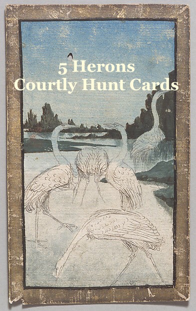
    Next to be shown is the Courtly Hunt deck once owned by Archduke Ferdinand II of Austria, but which actually dates back to the 1400s.  The suit of herons is particularly charming, I think:

    Engraved cards (less expensive than the hand-painted Courtly Hunt or Stuttgard cards) are then explored.  Those created by the unknown geniuses The Master of Playing Cards and the Master ES have suits named after flowers, birds, animals – even helmets!

    The Archduke must have had a thing about collecting playing cards because he also owned the Courtly Household cards – my favourite of these luxury cards!  These show all manner of people that would have been familiar at court – a Fool, a Potter (a woman), a Master of the Household etc – and we can glimpse their lives though the cards – their clothing, their surroundings etc.  Here the suits represent countries – Germany, France, Bohemia and Hungary.

    Then – joy of joy – we move south, to Italy and onto Tarot cards, namely the Visconti Sforza. As an aside –  I was delighted to see, in Andrea Aste’s new deck, The Book of Shadows Tarot, the reference to the Visconti’s ‘Love’ card in the rendition of his own Lovers card.

    Husband then whisks us north again to the Cloisters Playing cards, oval-shaped gems from the Netherlands, dating from about 1475.

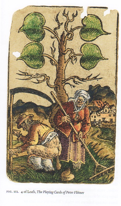
    Things then change focus and instead of looking at the luxury of the court and princely families, the cards look at peasants – primarily as the wealthy land-owners would see them – in the Nuremberg deck and that by Peter Flotner.  The status quo is wobbling, a burgeoning merchant class is earning cart-loads of money. The changing social situation is reflected in the cards – we see peasants shown largely as bawdy and stupid, indulging in foolish behaviour – there is farting, pooping and all manner of shenanigans.  You couldn’t play cards with your mother, using these decks:

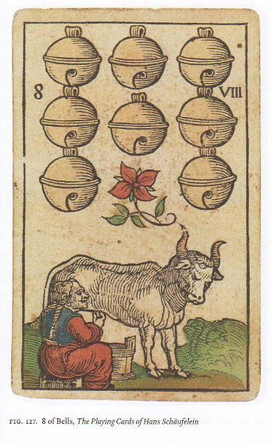
    That bull looks FURIOUS

    Yes.  A man having a poop!

    If you are a UK-based card buff would like to procure yourself a copy of the catalogue, you can do so via Amazon.  Fans in the US can also buy direct from The Met.

    And if you like the decks …. please check out Guinivere’s Games for her historic reproductions of three of the decks mentioned in the catalogue. They’re ‘spendy, but gorgeous!