The latest offering from that creative power-house that is Andrea Aste and Neil Kelso is the Lilliput Tarot. This is quite the sweetest tiny tarot deck that I’ve seen in ages and I pretty much bought one as soon as I saw it on facebook – a dinky, fully-illustrated 78-card tarot whose cards stand barely 2 inches tall in their stockinged feet (5.5cm in new money) and which arrives in a 2.5″ x 3″ box.
Hands up, Andrea and I go waaaaaaay back to 2015 when I encountered him and his infectious tarot enthusiasm for the first time in Italy, so I am primed to love just about everything he does. HOWEVER – this is a bought and paid for deck, so rest assured, these are my honest thoughts.
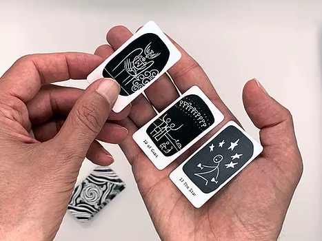
The cards arrive in the matchbox style box (of course!) in two little plastic sleeves within the partitioned box. I eagerly ripped off the plastic and started flicking through the cards. Reader, I liked what I saw: Each card, although tiny, contains the artistic essence of its Rider Waite Smith counterpart as well as the card’s name on the bottom.
Making the cards monochrome – each figure picked out in white against a black background that is itself set against the whiteness of the card – is very clever. For those of us who need spectacles to be sure of sending tweets that won’t result in on-line carnage, it is very easy to distinguish what the card is that you are looking at – even if you don’t have your specs on to read the card name.
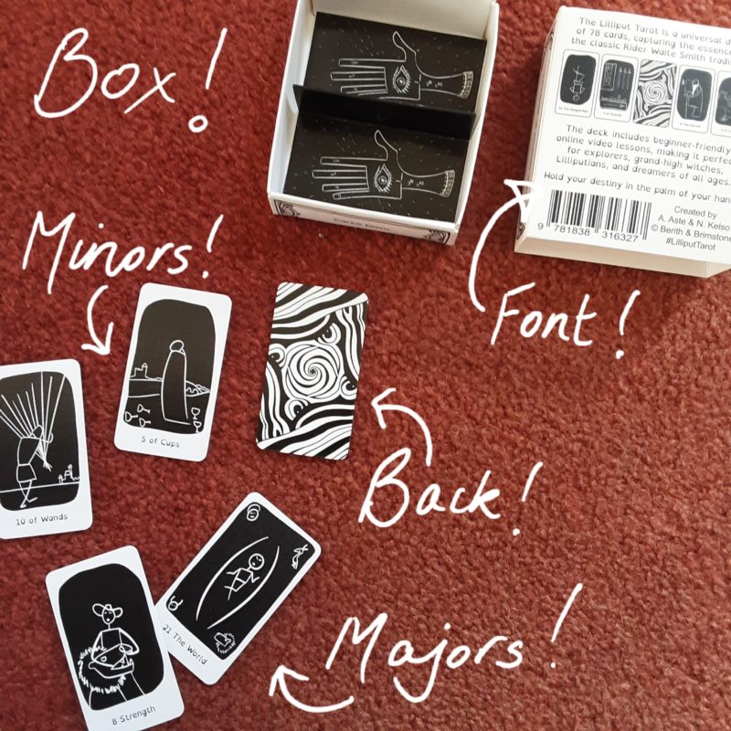
This first image shows you the two compartments inside the little box, the specially selected font, the card back and that this is a Strength 8 and Justice 11 style deck. Look how easy it is to identify the cards! Avert your gaze from any fluff on the carpet! When the tarot muse compels you to write, she rarely also suggests hoovering first.
I love the monochrome look. Too much colour would have complicated the small images and one would strain to catch details. As it stands, the deck is a simple ‘stick man’ type image which can be read very easily. I really love this little deck – it looks so simple and yet, if you have ever tried to create something yourself, you know that simple means ….really well thought through and faultlessly executed!
The cards have a linen finish which makes them easy to keep fingerprint free (matt and gloss black images being horrendous for attracting oily prints lol!)
Two things about the deck that I didn’t realise – check the back of the card tray for a link to resources for the Lilliput Tarot! AND, the smart font used on the box and cards has been specially selected by Andrea and Neil to help readers who may have Dyslexia read more clearly. Another well-thought through decision. And for those without Dyslexia – it’s a really nice font!
Is this deck PERFECT?! Not quite; I do have one gripe. My area of interest is the court card section of any deck and I was disappointed to see that the court cards for all four suits are exactly the same stylised figures but with their suit symbol in the top corner. If all the other Rider Waite Smith cards could be distilled down to a line drawing for this deck – why not the courts too?!
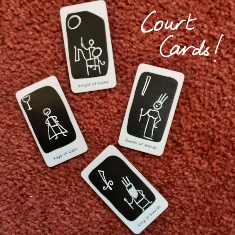
I teach different ways to read the court cards and the most obvious, easiest way that does not rely on any kind of memory feat is to simply go by what you see in the image. Having all ranks (ie all Pages with the same image, all Knights etc) the same drawing apart from the corner suit symbol means that readers can’t do that.
Now, before I throw myself down on a divan and have a cry about the court cards in the Lilliput Tarot, I thought I’d ask the lovely Andrea about the deck. This is what he said:
“This aims to be a universal deck combining RWS and Marseille decks: so the Major arcana and the Court cards are more based on the Marseille, while the minors are more inspired by RWS. Our priority was to make this deck easily readable, immediately accessible by everyone, and even at a glimpse you can see the difference between court cards, major and minor arcana.”
And this is very true – you can very easily tell which card is which, even the court cards that I am having a moan about lol!
It was at this point Andrea pointed out to me the link on the back of the tray, that takes users to a set of video and pdf resources for the deck. So, don’t worry too much about the Courts – there is sufficient information on the deck’s downloadable and print-outable (is that even a word?) pdf to help you work with them.
While you are over at the Oracolarium website, please check out the other amazing, inventive Tarot creations in the shop!
The guys also have a new Tarot book out called The Lantern Collection. Andrea says: “The Lilliput Tarot is featured in the book illustrations, but the book goes beyond and far far away: it is a collection of essays, very user friendly but very deep too. So the book and the deck can be enjoyed separately or together.”
Who would like this deck?
A beginner – it’s an excellent, distraction-free first deck.
An experienced reader – for exactly the same reasons!
Anyone looking for a tiny deck.
Anyone looking for a black & white deck to add to their collection.
Anyone who appreciates an independently produced deck at mass produced deck prices (It’s a tenner!)
In short, it’s a super deck for dreamers and diviners of all ages and levels!

Stop being confused by court cards! Start being excited by the possibilities! Become a court card adventurer along with me 🙂 The Tarot’s Court Cards are my specialist area. They talk to me. Not LITERALLY though ….