I am sometimes contacted by people who are trying to raise awareness for their Tarot Kickstarter projects and, mostly, I don’t get involved. However, the Locus Tarot which went live on 5 March piqued my interest and I wanted to find out more.
Locus is an 80-card deck that is SO stripped back that if it took anything else off, it would be on a public indecency charge!
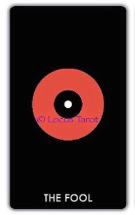
I was about to lead-off my look at the Locus Tarot by saying that this deck has unillustrated pips… but truthfully the Majors and Courts are just as ‘unillustrated’ as the pips, relying on arrangements of variously coloured circles – or cut-away circles – and dots on either coloured backgrounds (Minors and Courts) or a black background (Majors).
I asked the deck’s creator, Mike Stop Continues (real name – I asked lol!) to guide me through it – with special emphasis on the Court Cards, of course!
Can you explain, briefly, why you have gone for such a stripped back and minimalist look for your deck?
Sure! The idea came about after a few years of learning the tarot. I began to feel that for all the variety of decks out there, the true nature of the cards were forever out of reach. I came to realise that each card is a sliver-of-infinity, countless possible interpretations contained within, but that an illustration could only depict a single variation. We do our best to remain malleable as readers, but seeing the same images time and again entrains the mind to see things just one way. Besides, if the Eight of Cups doesn’t always indicate a sea journey, why on earth should it depict one?
I realised I was looking for a deck without representational art. I wanted a deck that would point to the forces at work, rather than aim to illustrate one variation. No longer would the cards mislead a reader’s intuition, instead taking the role of The Hierophant, who does not lead, yet points the way.
No such deck existed, so I had to make it myself.
What sort of reader is your deck aimed at – beginners or experienced readers?
I like to think the deck is ideal for beginners, masters, and non-readers alike.
Beginners will find in the Locus all the great forces of the tarot without the hurdle of learning the meaning of 78 cards. Rather, the beginner can learn just the primary rules (depicted in the patterns of each card) and read them with ease.
Masters will find the Locus to be a fresh perspective on their craft and a very useful lens through which to see the world. I believe the diversity of tarot is one of its greatest strengths, and I do not seek to replace tradition reading style, but to join with it in the support of something greater.
Finally, I think the deck great for non-readers who for whatever reason lack the interest in traditional tarot, yet might find the Locus to be a consistent, modern tool for self-discovery, creative exploration, or free association. Perhaps it’s the perfect gateway into the world of the arcane.
The suits are named, Stones, Cups, Rods and Swords and they are colour-coded, but not necessarily the colours that people would associate with those suits – green for Swords, for example. Why did you select the colour/suit matches that you did?
I was originally working with a more traditional colour palette bent towards the seasons. The colours were fantastic, textured pastels—olive, ochre, mauve, and steel. In some other context, they would have been marvellous, but for the purposes of this deck, they left me feeling trapped. I worked for months tweaking these colours and finally threw them all out. They just didn’t work.
But in their place, I found red, blue, yellow, and green. Red for the root chakra and the needs of the physical body, blue for the throat chakra and our communion within ourselves and social groups, yellow for the solar plexus at the seat of our power, and green for the heart-mind at our meditative centre. Put differently—red for the clay of the earth, blue for the waters of the sea, yellow for the fires of the sun, and green for the wind through the grass and the trees.
 Let’s take a look at your Courts. Other than the colour coding, the images are the same for each rank, ie the Page of Stones is the same image as the other three pages, but in red. I know that the titles are on the cards, but won’t this make things difficult for readers to interpret?
Keeping in mind my goal was not to represent, but to signify, I think it actually makes it easier for the reader to interpret.
Rather than depicting one house as fair and one house as dark, and rather than positioning otherwise vital personages in but one symbolic portrait, I chose instead to point to the fact that truly, all Pages share a Pageness, just as all of house Stone share a general Stoniness.
I believe that suggesting anything further about any of the Royalty is misleading. To me, the Royalty each embody a cluster of personality traits, these traits sometimes arising in a man, sometimes in a woman, and sometimes simply surfacing within ourselves. Since so much of others’ character is a matter of our own projection, we must often look within for the persona we truly engage with in the presence of a court card.
I agree that all Pages share qualities and all members of the same household share qualities. I also agree that each court embodies a cluster of personality trait – in either man or woman. But I believe this regardless of what deck I’m using – does there need to be a deck where these methods of interpretation need to be built in to the card images? Will the Locus Tarot cards not INCREASE the amount of projection that takes place, because there is so little imagery for a Tarotist to work with?
require([“mojo/signup-forms/Loader”], function(L) { L.start({“baseUrl”:”mc.us2.list-manage.com”,”uuid”:”a1532eabd65d034238367b6cc”,”lid”:”d3826d02b7″}) })
Such a great question! There are some tools, like Astrology, that try to take the reader out of the picture. These tools approach divination more as a science than an art. I do fully believe that science will ultimately reveal what about the universe makes divination work, though I feel all divinatory tools we currently possess draw their strength from the years of evolution that have made human beings so receptive to the world around us. We are genetically tuned to divine much better than any technology we’ve yet developed.
This is why I feel it’s so important the Locus strip away even imagery. If Astrology is divination as science, then the Tarot, and the Locus more than any deck I’ve seen, is divination as art. The more we peel away, the more we reveal. Projection is only the reverse of intuition, and while the danger of projection is just as strong regardless of what deck one uses, I feel we stand to gain even greater rewards for giving intuition full reign.
Another example is in the Major Arcana where cards such as The Fool, Justice, Temperance and Judgment are all shown as concentric circles – just with different coloured outer rings. Why are there groups of four cards depicted this way?
In removing the numbers from the Major Arcana, I began to see them as the intersection of elements in varying arrangement. The 24 cards are split into four elemental groups. Within each group, there is one card influenced by each of the four elements. The Chariot, for example, is water influenced by fire.
That leaves two cards within each of the four elemental groups. One set of four depict elements in full engagement with the other forces of the world, which I often call extroversions. Another set of four—The Fool, Justice, Temperance, and Judgment—represent the elements acting without impulse within themselves. This group, I call introversions.
The extroversions each represent the method through which they grant access to the world and the powers with which they engage it. The introversions, at the opposite side of the spectrum, represent the center from which that element acts, and the inherent balance present within that elemental force. The Fool offers innocence and curiosity from which one would embark on the physical world, Justice offers balance and inevitability to broach the emotional world, Temperance offers experience and composure from which to act, and Judgment offers experience and renewal to those engaging in the intellectual and spiritual exploration.
For the same reason that the court cards have similar patterns with differing colouring, so too do the Majors. The introversions each feature a disc of their primary element with a white dot symbolizing stability at their centre. In all majors that white dot appears, one can expect a force un-inclined to reach.
This question also points to another difference in reading the Locus. Removing the illustrations is not merely a surface change. The goal is for the Locus reader instead to interpret the intersections of these forces differently depending on the context. Truly, the names of all the cards remain only as a guide.
Where I to interpret, say, Temperance in a reading, I would not immediately go to the traditional notion of a stable centre from which to act or to refrain from action. I would read the force as the undiluted core of fire. Were this drawn in a spread about a new relationship, I might interpret this card to suggest their passion was secure, or that so long as the pressure was maintained, the new challenges would not be their undoing. These interpretations would vary based on the situation as I knew it to be. In a reading about a business venture, I might read the card to suggest the momentum of the current initiative will persist from beginning to end, or perhaps that the actions required for a successful conclusion are ultimately the responsibility of the querant himself.
Sounds really interesting – but quite tricky to pull-off convincingly. While many Tarotists use elements whilst working with the cards, I think they form an additional layer that a Tarotist could incorporate or omit (like astrological associations) but your deck uses them as the absolute foundation for interpreting the cards – does your accompanying book explain how to interpret expressions like ‘undiluted core of fire’ in sample situations?
It most definitely does! Ultimately, the system is much easier to apply than it sounds. Most aspects are concepts readers are already incredibly familiar with. The booklet delves into the concepts (20 in all—10 numbers, 4 elements, positive/negative, macrocosm/microcosm, inner/outer), then explores how to combine them in each Arcana, then goes into contextualizing their meaning in spreads, and finally offers a card-by-card interpretation with regards to a few different topics.
The Courts tend to represent either the querant (or someone known to them) or energies around the situation in question, do your Courts represent the same?
In the Locus Tarot, the court cards can always represent an internal aspect of one’s self, or someone on the outside. Any court station can be of any gender. Their names are retained entirely for reference.
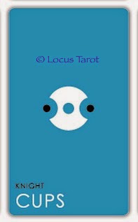
Looking at your Knight cards, I feel that the two poles that the Knights veer between are depicted and I like how the image looks a bit like an axe head (probably not the sort of interpretation that you envisaged lol!), but how one distinguish the characteristics of the Knight of Cups from the Knight of Swords?
An axe head! Fantastic! I see it more as a shield myself, but I think of that card like psychology’s picture of the rabbit and the duck. Some people see it one way and some the other. Given a long enough timeline, I suppose we might shift back and forth over which one we see more readily.
In the case of the Knights, I consider the only relevant distinction between them to be the element of their house. They are otherwise similar in their knighthood. After all, all kinds of people find themselves to be lovers or champions, even if they go about such activities in completely different ways. The difference, most importantly, is the context of the reading.
Yes, I can totally see that, Mike 🙂
But if I’m reading this as an axe-head or a shield – am I not defeating the purpose of you stripping out the imagery in the first place?
Valid argument, and one I deliberated over for a long time, but these signs felt right to me, and so I stuck with them, though not because of how they might be interpreted representationally, but for how they evolve from station to station.
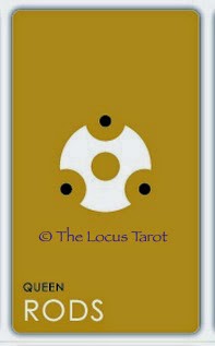
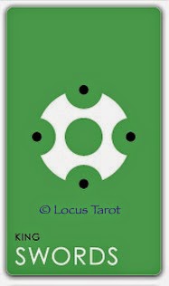
The images do suggest a Page’s helmet, and Knight’s shield, a Queen’s breastplate, and a King’s round table, each offering the increasing stability of their stations, but the relationship between these images is more important. If you take a look, you’ll notice that each symbol contains all of the elements of the previous symbol, only adding to it, just as one accumulates experience with the increasing stability of age. I prefer this perspective of the symbols, perhaps more so for the representationalism my unconscious managed to slip through.
That’s interesting! why would the Pages have a helmet, the Queen a breastplate and the King a round table. For example – the Queens are not particularly warlike in their interpretations. If anything I see them more as the Tarot’s guardians – perhaps better suited to a shield 😀
I think about it this way. The Pages’ internal motivation is governed by air, their thoughts, and so they protect their head. The Knights are motivated by fire, their potency, and so protect their hands. The Queens are motivated by water, and must protect the heart of their houses with a breastplate. The Kings, motivated by earth, rule with wisdom, and protect the stability of their house at the round table.
Are there any astrological associations that you would want coupled with your Court cards. The King of Swords is, traditionally, associated with Fixed Air and Aquarius.
My primary aim for the Locus Tarot was to offer readers and actionable model of the world with the kind of beautiful congruence I sense in the universe itself. Just as with the Kabbalah, and just as with numerology in the Major Arcana, I have never felt Astrology to be a very useful addition to the Royalty.
It’s an 80-card deck – what are your additional cards and what do they bring to your Tarot?
The million-dollar question!
In designing discovering the patterns of the Major Arcana we talked about earlier—the influenced cards, the introversions, and the extroversions—I soon came to realised the patterns fit so precisely across all 22 traditional Majors. The only problem was that two from the final group, the extroversions, were missing!
Though the Locus makes a clean start of so much of the tarot, I was not eager to break convention unnecessarily. I only changed things where it made sense, and only minimally. For a long time I considered changing the names of cards or removing the text altogether, but I pulled back, fearing such extremist would make the deck an unrealistic reach for new readers.
Nevertheless, I knew I needed two more Majors of a certain character. The Wheel was the extroversion of water and The Universe was the extroversion of air, but I still needed the extroversions of earth and fire. I looked around, and found nothing that fit the bill. The task fell to me.
A few different naming conventions came to mind, but considering the character suggested by The Wheel and The World, I felt The Bridge and The Portal to be the perfect complements as the extroversions of earth and fire. Remember, if you will, that the extroversions concern access and passage.
The Bridge grants passage to even the most remote vistas of the physical world. The Wheel opens us up to the highs and lows of our emotional responses. The Portal links us to all possible worlds, giving us choice and inspiring inventiveness. The Universe, finally, is the entrance to our higher selves, where thought finds clarity and the spirit finds wholeness. Just as the other sets of Majors the Locus Tarot presents, I find this set as integral as it is informative.
Thank you so much for taking the time to chat with me, Alison! I truly appreciate it. I ask only that your readers check out the Locus Tarot campaign, and if they like it, to support it, share it, and ask me anything!
I’d love to know what you think of Mike’s deck!
Stop being confused by court cards! Start being excited by the possibilities! Become a court card adventurer along with me 🙂 The Tarot’s Court Cards are my specialist area. They talk to me. Not LITERALLY though ….