Tag: tarot deck review

  • Deck Review | Pagan Otherworlds Tarot

    Sometimes I sign up for Kickstarter Tarot campaigns and forget all about them until a little package plops onto the doormat many months later. No such casual forgetfulness with the Pagan Otherworlds Tarot by Uusi in the US.

    TABI backed this particular deck and I thought that it was worth a personal punt too, so my deck arrived and gosh – is it love at first sight or what?!

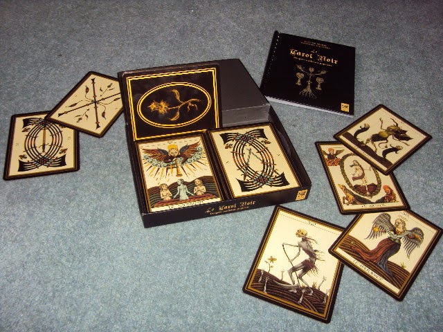
    The tuck box is beautiful, using the same pattern that is found on the rear of the cards.  Whereas the box has subtle glinting gold highlights, the card back is glint-free.  That’s probably a cost thing and anyway, who really looks at the back of cards when the front is so pretty?

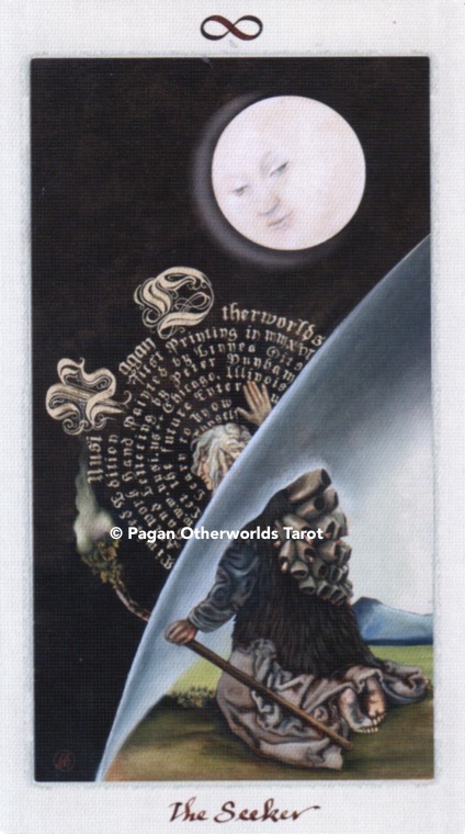
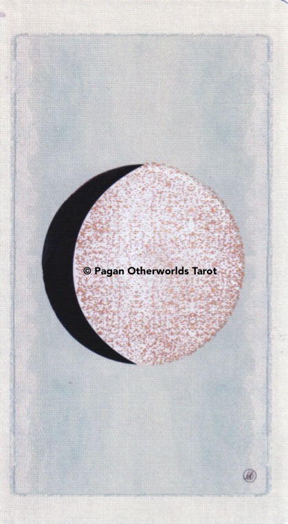
    This is not a 78-card deck, we have ADDITIONAL cards, namely a Seeker card and five phases of the moon.  Since the deck doesn’t come with a LWB, one can put whatever emphasis you like on the use of these cards!

    Waxing lyrical

    The Seeker card makes a natural significator card – sparing you the dilemma of whether to filch a court card out and thereby taking it out of circulation for the reading.

    The moon phase cards DO have slightly glittery highlights which adds to their specialness.  These cards could be removed for general 78-card deck work and included when some sort of time element was required? Or perhaps to add clarification as to what phase the client’s situation might be:

    new moon = just beginning
    waxing moon = gathering strength
    full moon = at its strongest
    waning moon = losing strength
    dark moon = completed

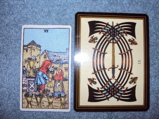
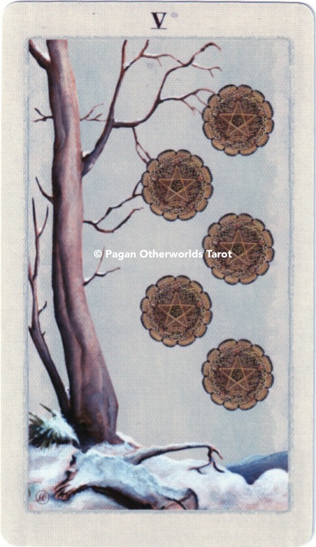
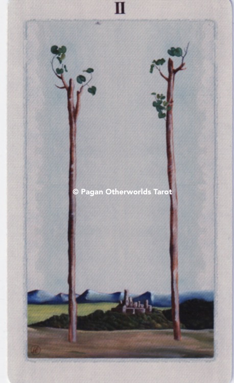
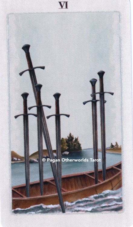
    Suits are Wands, Cups, Swords and Pentacles and the courts are Page, Knight, Queen and King – as you can see in the video below.

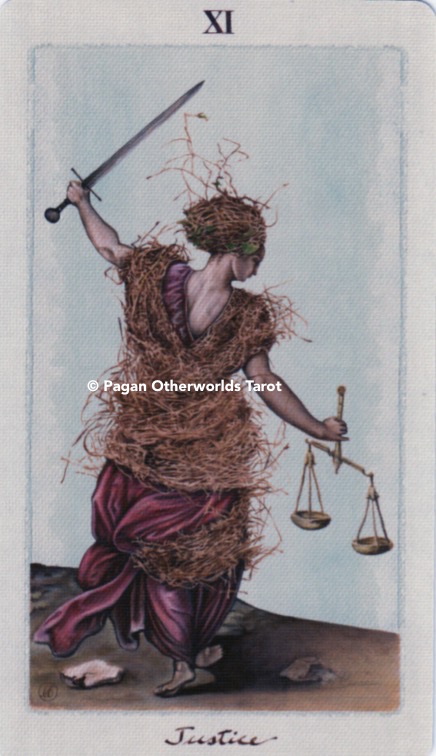
    There is no particular colour associated with any suit and the overall palette is warm in tone and muted in shade, with all the characters presented against a barely-there blue sky.

    There are animals associated with some of the suits – lions for Wands for example.  I do query why the King of Pentacles wears a ram head-dress when he’s associated with Taurus, whilst the Queen wears her Capricorn horns a-ok …. and doesn’t the Knight of Pentacles look like a painting of Napoleon?!

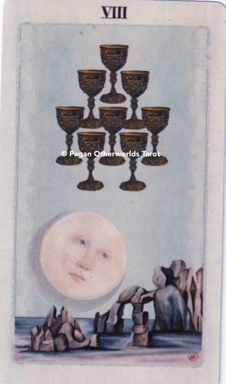
    It is a really lovely set of Minor Arcana cards.  There are no human figures in any of the Minors, but that is not to suggest that this is a set of ‘Marseille’ unillustrated pips!  Here we have elements of the Rider Waite Smith crafted into the card along with the requisite number of suit symbols.  It’s a kind of hybrid and I think that it works beautifully.

    My scanner is not managing to capture the creamy off-white tones of the card stock, I’m afraid.

    As far as the Majors go, everything is titled as you would expect and has Justice at XI and Strength at VIII.

    The card stock is beautifully slippy with a linen finish and it’s a joy to use.

    Is it perfect? Almost!  The only thing that I have a quibble with are the one or two of the heads and faces.  I find there is an occasional awkwardness about one or two of them – for example, the Page of Cups (see video).

    I’ve been using them the past week for my daily draws on the Tarot Thrones facebook page.  You’re not ‘liking’ me there yet?! Come on over and see what’s there!

    That said, it does not detract from my enjoyment of the Pagan Otherworlds Tarot one jot.  I adore the classical otherworldly illustrations. Are they medieval-inspired? Renaissance inspired?  It doesn’t matter, get yourself a copy and get ready to join the fan club.

    To buy your own copy:  Visit Uusi
    Follow them on Facebook

  • Deck Review | Le Tarot Noir | Ternel & Hackiere

    So, someone waved this deck in front of me on Facebook and, of course, I had to buy it.  I must learn some restraint.  But not right now …


    I quickly sent Matthieu an e-mail and we organised a sale to the UK.  It arrived promptly and well wrapped (in fact, it took me a knife and a pair of scissors to prise my way into the package!).

    The box is – unsurprisingly – black.  Also sturdy, which makes a nice change from the wobbly cardboard that I usually flatten out and squirrel away at the back of a drawer.

    The cards are MASSIVE (10.5cm wide by 14cm tall) and have a stylised flower on the card-back (not reversible) bounded in a golden square and oval.

    Le Tarot Noir – bigger than your average card…

    I was very keen to get my paws on the accompanying book for this deck and for some INEXPLICABLE reason I was surprised that it was in French.  I mean I only bought the French-named deck from a French man, on his French website…what was I thinking?!

    Anyway, turns out that the book isn’t hugely important from a divinatory point of view becuase it contains no divinatory information about the cards.  This was designed as a proper deck of playing cards.

    As you can tell from the main image – we have unillustrated pips in this deck, but to describe them as ‘unillustrated’ is not to do justice to the beautiful workmanship of the Minor Arcana.

    The colours throughout the deck are muted and sophisticated.  There is no suit/colour identification – which ties in perfectly with pre-Golden Dawn Tarot deck ethos.  The deck is edged in gold which looks beautiful against the black of the rest of the cards.  Black does, however, show up greasy fingerprints – so sorry about the smears on the various card images!

    Gold Edging.  It IS there, I promise you!

    The expressions on everyone’s face are somewhat lugubrious and gives the deck a puff of Deputy Dawg charm that offsets the strange pale and slanted eyes of many of the creatures in the cards (see the Knights in the video)

    There are interesting touches to some of the Majors – the Hierophant card has initiates who have the head of sheep (a reference to being led like sheep? Or the Pope as the leader of a flock?) and the horses of the Chariot have sleek white skull-like heads which I find somewhat unnerving!

    The courts are, as you can see, traditional representations of the usual Valet, Knight, Queen and King.  Neither the Kings of Cups nor Pentacles hold weapons – their power is, according to my dodgy French translations – in commerce (Pentacles) and the threat of the Hereafter (Cups).

    Now, a word about the book.  I am ULTRA careful with books and was even taught how to open new books properly by Mr Scobbie, my old English Teacher.  This one still cracked and began to fall apart within a couple of days.  BUT don’t let that put you off.  I solved the problem by going into my local printer and having him cut off the spine and replace it with a plastic comb.   All for the princely sum of £3.00.

    And now my book is safe from further damage AND lies flat when I am hovering over it with my school French dictionary…

    So, what’s the verdict?  It’s big and it’s beautiful.  Will I be using it for readings? Not until I am more proficient at reading with unillustrated pips.   Do I like the artwork? Yes, I do – it’s traditional and contemporary all at the same time!

    Am I selling it on? Not on your Nelly!

  • AnnaK Tarot | Deck Review

    Oh this is loooooovely!

    Originally self-published in 2009, the
    AnnaK tarot has now been taken up by Llewellyn – thank goodness,
    because it’s a charming little deck that deserves to be widely
    seen.

    It arrives in a nice presentation box
    along with a chunky little accompanying book of 230 pages. Not every page of the 230 is filled with writing – some are blank (well, they are lined for you to write on)  and 78 of them are the card illustrations themselves. Each
    card is illustrated in B&W with the
    interpretations on the facing page, sometimes including a little tip from Anna. 
    The deck measures 7cm x 11.5cm (3″ x 4.5″ in
    old money!) and is of thin – but beautifully slippy – card stock
    which ensures the deck shuffles like a dream from the start. 
    With an her World tree motif on the
    back (see scan below), the cards can easily be used for reversals.
    Anna K touches on reversed meanings in her accompanying book, but they are not integral to her
    use of the deck.
    Having the cards bordered in black
    really makes the colours of the deck really pop – golds contrast
    magnificently and dark cards are, erm, darker. 

    As far as card names go, no great
    changes here – suits are Swords, Rods, Pentacles and Cups with the
    Majors as you would expect (note: Strength is XI and Justice is
    VIII)
    The book also contains hints on how to read, as well as some of Anna’s own insights into using Tarot – and some spreads for you to play with too, of course!

    *rubs hands together*  Let’s dive in!
    The deck is based on the Rider Waite
    Smith and if you can read with the RWS, then you can read with the
    Anna K. It’s not a simple clone though, there ARE cards that Anna
    has depicted in a different way to the RWS – the 2 of Swords for
    example (see above).

    Despite this rooting in The Golden Dawn, Anna has
    pared back the occult symbolism. For example, there is no mention
    made of any astrological associations for the cards. However, the suits ARE
    accorded elemental associations (eg Rods are related to Fire) and the
    ranks of the courts are Page, Knight, Queen and King.  

    Each Page is depicted as a very
    young person involved in recreational activity that one might
    associate with the suit.  For example, the Page of Swords is
    practising with his Sword (literally, striking at a straw man!)
    and the Page of Wands gazes longingly over the restraining wall of his compound.
    Anna says that the Pages are ‘invitations to cultivate certain
    attitudes’.
    The Knights are interesting because
    they are not on horses (or creatures of any kind!) Anna does
    provide sufficient symbolism that you can quite easily read what the
    Courts are about. Our Knight of Rods for example, is running (just
    as he would be on his horse) with a cloudy sky behind (perfectly
    fitting the Knight’s blustery ‘rush-in’ attitude) with a banner in
    hand – a banner that obscures the perilous path that he is running
    along!
    The Queens, like the Kings, are not
    depicted on thrones. Intriguingly, the Queens are all depicted
    outside, in nature – representing ‘values or habits’. Conversely,
    the Kings are all depicted indoors (with the active King of Wands
    striding towards the outdoors!) and show outer life or actions.
    ‘Well, this is all GREAT’ you might be thinking, ‘but whaddya REALLY think of
    the deck?’
    Truthfully, I really like it. It’s perfect for a
    beginner, freeing you from the confines of Golden Dawn inspired ‘bolt ons’ such as astrological associations and complex
    alchemical/hermetical symbolism which are often not needed in a Tarot
    reading.
    Anna works from her imagination, the
    figures are not taken from life and while most of the illustrations
    are attractive (especially Death – he’s totally smokin’ hot btw!)
    her emphasis is on the card’s character’s emotion and expression, so
    if you like all your figures to be pretty and serene, this lively
    little collection might not be for you.
    To find out more about the deck, visit Anna K’s site:  This is the English language version site (Anna K is Austrian)